Table of Contents
- Start with the bed, not the walls
- Choosing a spring colour palette
- Layering for lighter months
- Texture as a quiet anchor
- The small details that shift the room
- A note on scent, light and sound
- Spring bedroom styling FAQs
Most bedrooms carry the weight of winter by the time March arrives. Heavier fabrics, darker tones, layers chosen for insulation rather than ease. The room works, but it feels enclosed, and the eye notices long before the body does.
A spring refresh is less about buying new things and more about editing what is already there. Swapping a duvet cover, changing a cushion, moving a lamp. Small decisions, made with a sense of the season, that shift the feel of the room from hunkered-down to open.
This is the styling side of a spring reset. For the practical work, switching to a lighter tog, moving to more breathable fabrics, and adjusting to lighter mornings, our spring sleep reset guide covers that ground in detail. For the decluttering and deep cleaning that often goes alongside, the 5 steps to spring cleaning your bedroom piece is the place to start. What follows is about how the room should look and feel once the practical work is done.

Start with the bed, not the walls
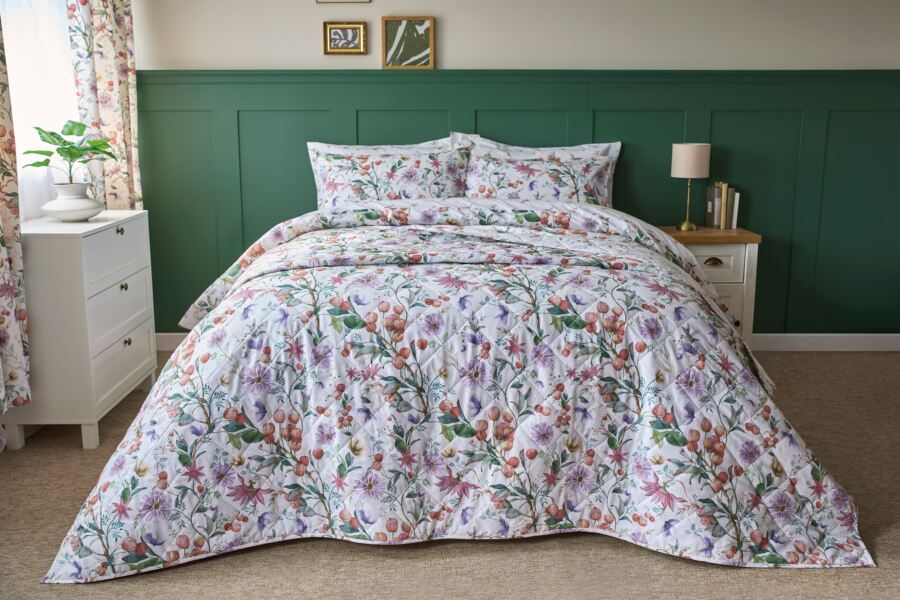
The bed is the largest visual element in almost every bedroom, which means it is also the fastest way to change how the room reads. A fresh duvet cover and a pair of new pillowcases will do more to shift the feel of a space than a weekend of repainting, and the cost sits in an entirely different bracket.
A new duvet cover in a lighter weight fabric, or a change from a darker winter tone to something quieter and more open, resets the room before the rest of the styling decisions get made. Everything else, the cushions, the throw, the bedside arrangement, works in relation to the bed. Get that right first and the rest tends to follow.
Choosing a spring colour palette
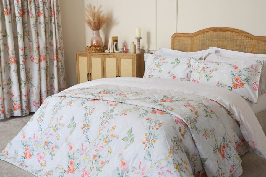
Spring colour does not need to mean pastels. The UK season is more muted than the word suggests, soft light, damp earth, early green, pale sky, and a bedroom palette that matches that tends to feel more considered than one borrowed from a holiday brochure.
A few tones worth considering:
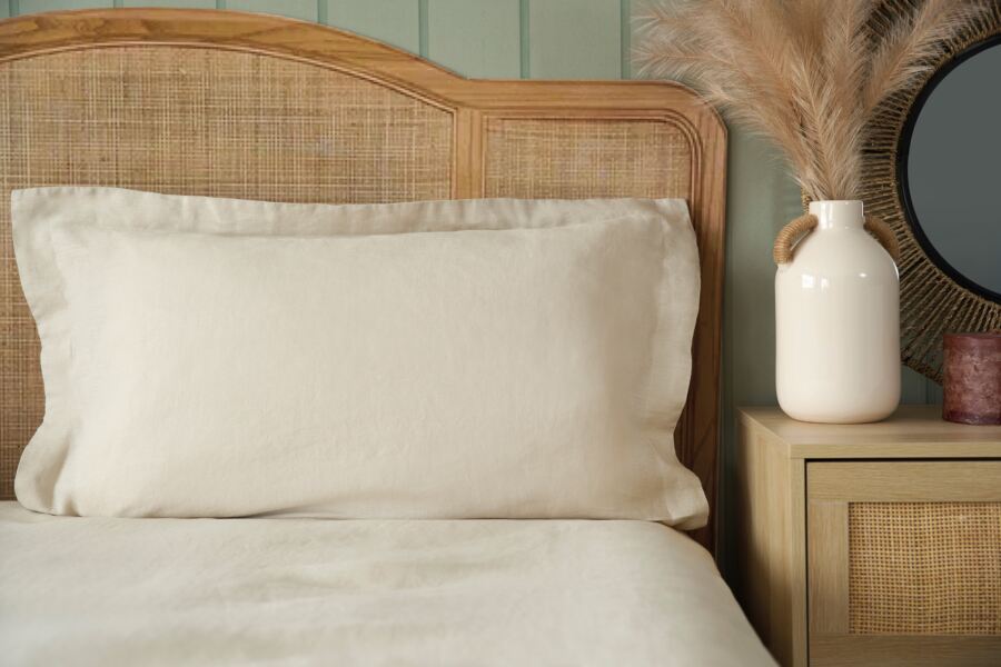
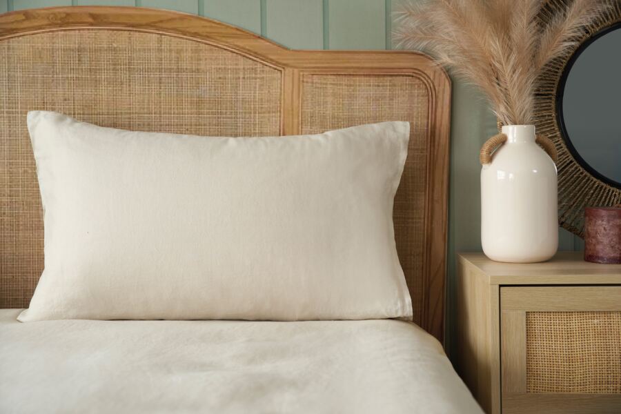
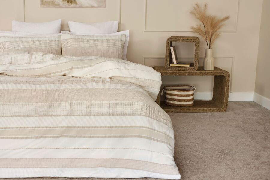
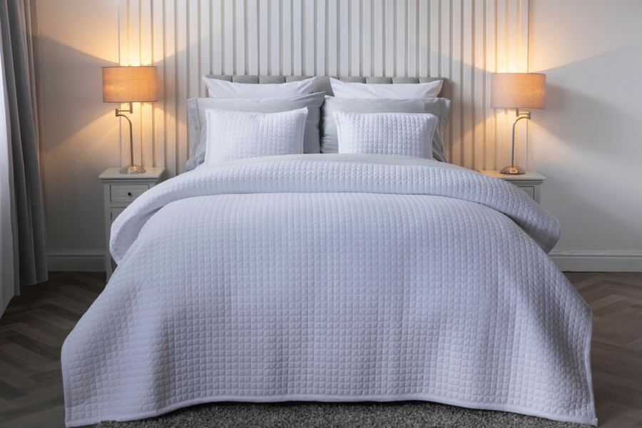
Soft whites and creams
The most versatile starting point. A crisp white or warm cream duvet cover opens the room up, bounces the longer daylight around, and sits well with almost any existing bedroom furniture. For sleepers who want the light, airy feel without committing to a stronger colour, this is the quietest route.
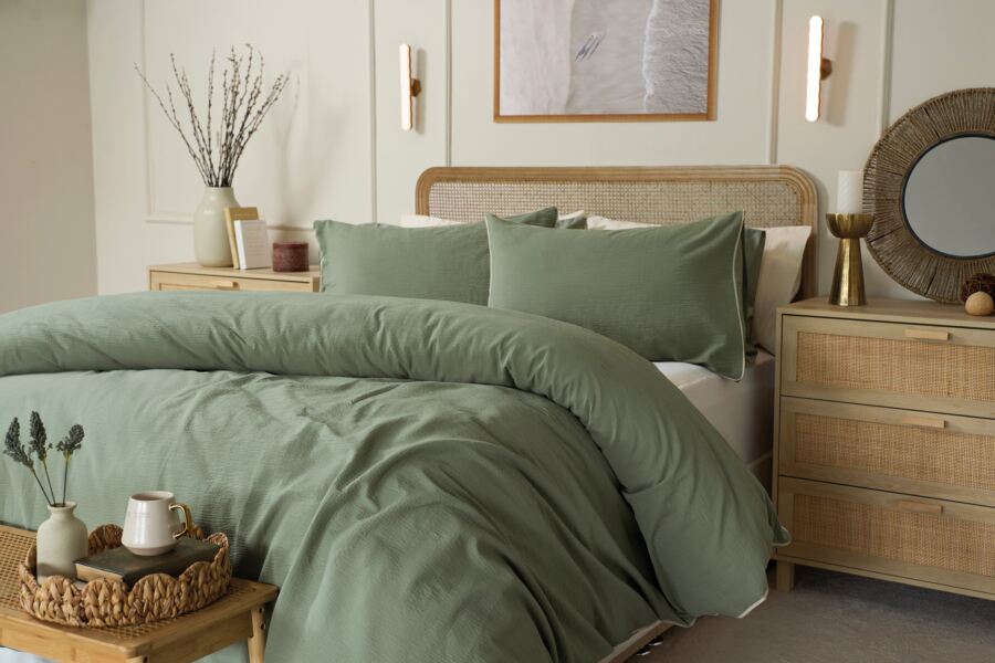
Sage, eucalyptus and soft greens
Green is the colour that most suggests the season without shouting it. A muted sage or soft eucalyptus tone feels natural rather than decorative, and pairs well with oak, walnut and linen. It is also one of the few colours that reads as restful in almost any lighting.
Clay, stone and putty
For rooms that already lean warm, softer earthy neutrals, clay, stone, putty, carry the spring mood without cooling the space down. These tones work particularly well in older houses with warmer wood tones and lamplit evenings.
Soft blues
A pale, dusky blue is one of the most restful colours a bedroom can take. It suits north-facing rooms that want warming up visually, and it sits easily alongside whites, creams and greys already in the room.
A practical tip: the easiest palette is three tones, not one. A base colour on the duvet, a slightly deeper or contrasting tone on the cushions, and a neutral on the throw. The room looks considered without feeling matched.
Layering for lighter months
Layering is the single most useful styling principle for a transitional season. UK spring nights can still drop into single figures, and mornings can be unexpectedly warm. A bed built in layers lets the sleeper adjust without having to commit to one tog rating or one fabric choice.
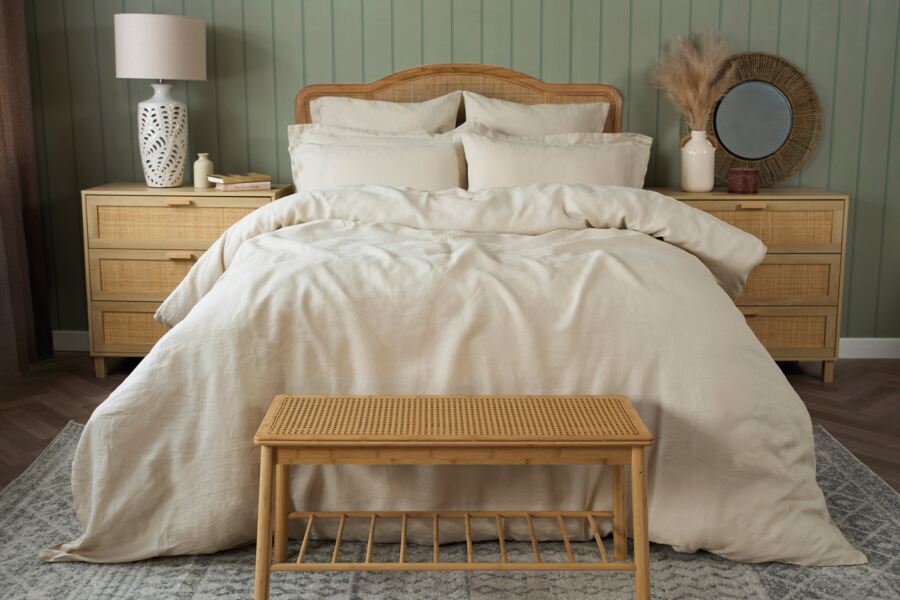
A working formula: a fitted sheet, a flat sheet or lightweight quilt, a lower-tog duvet, and a folded throw or blanket at the foot of the bed. The throw is the layer that earns its place through the shoulder seasons, pulled up on cooler nights, folded back on warmer ones. A quilted bedspread or throw also adds visual weight to the foot of the bed, which most rooms benefit from aesthetically.
Pillow stacking is a related move. Two sleeping pillows laid flat, two larger Continental pillows propped behind them, and a smaller cushion in front is the look most hotels rely on for a reason: it fills the head of the bed, adds texture, and photographs beautifully. It also takes thirty seconds to undo at bedtime.
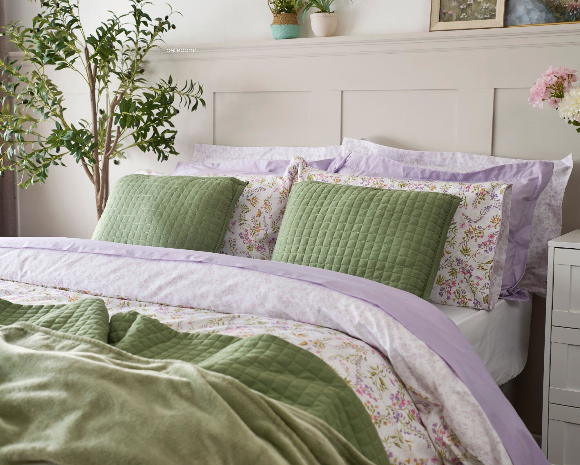
Texture as a quiet anchor
Spring bedding has a reputation for feeling thin or underdressed, which is a problem of texture rather than weight. The trick is to replace the warmth of winter layers with tactile variation: a crisp cotton sheet against a softly crumpled linen duvet cover, a smooth sateen pillowcase beside a knitted throw.
Natural fabrics do the heavy lifting here. Cotton percale feels cool and crisp; 100% linen has that softly rumpled character that suits the season perfectly; bamboo viscose sits somewhere silkier and cooler still. Each feels distinctly different against the skin, and the combination of two or three reads as luxurious in a way a single fabric rarely does.
The same principle applies beyond the bed. A linen curtain softens differently to a cotton one. A knitted cushion beside a velvet one adds visual depth without adding colour. Texture is what keeps a lighter palette from feeling empty.
The small details that shift the room
A proper refresh is rarely about the bed alone. A few smaller moves, done together, often do more than any single larger change.
Clear the surfaces. The tops of the chest of drawers, the bedside tables, the windowsill. Take everything off, wipe them down, and return only what genuinely belongs there. Visual clutter is exhausting to live with, and surfaces that have been quietly accumulating since autumn are usually the first thing to address.
Reassess the lamp. Winter lighting tends toward the warm and enclosing. A softer, cooler bulb, or a different lamp altogether, changes the mood of the room after sunset. A 2700K to 3000K warm white is restful without being amber.
Add something living. A single plant, a small vase of cut stems, a bowl of fruit on the chest of drawers. Anything that is actually alive brings a quality to a bedroom that no styling can quite replicate. It does not need to be anything elaborate: tulips, eucalyptus, or a few branches of early blossom will do the work.
Move one piece of furniture. A chair repositioned toward the window, a bedside table swapped for a small stack of books, the bed itself shifted slightly if the room allows. Familiarity makes rooms invisible. Small changes make them visible again.
A note on scent, light and sound
Styling a bedroom is not only a visual exercise. The senses that matter most for rest, smell, light, and sound, are worth thinking about as part of a spring reset too.
Scent. Winter scents tend toward the heavy, amber, cinnamon, warm spice. Spring invites something lighter: lavender, bergamot, neroli, sweet pea. A small diffuser, reed sticks, or a discreet bowl of dried lavender on the dressing table is enough. Scent should be noticed on entering the room, not from the corridor.
Light. As the mornings get lighter earlier, eye masks and blackout blinds earn their place. For evenings, dimmer bulbs and table lamps are more restful than overhead lighting, and the transition into sleep is easier for it.
Sound. A quieter consideration, but windows that have been shut all winter are worth opening during the day. Fresh air moves through the room, reduces the stuffy feel of long-closed spaces, and makes the bedroom feel genuinely seasonal rather than just redecorated.
Styling a bedroom for spring is a series of small edits, a lighter duvet cover, a softer palette, a cleared surface, an open window, rather than a single transformation. Done together, they change the feel of the room in a way that repainting alone rarely achieves. For the practical work that runs alongside the styling, swapping to lighter tog duvets and more breathable fabrics, our spring sleep reset guide covers it properly. For ideas on the fabrics themselves, the role of natural fabrics in sleep quality is the longer read.
The goal of a spring reset is not a new room. It is the old room, lighter.
Spring bedroom styling FAQs
What are the best bedding colours for a spring bedroom?
Soft, muted tones drawn from the season itself tend to work better than brighter pastels. Sage and eucalyptus greens, clay and putty neutrals, warm creams, and pale dusky blues all suggest spring without feeling overly decorative. A three-tone palette, a base colour on the duvet, a deeper or complementary tone on cushions, and a neutral throw, creates a considered look without matching everything too closely.
How do I make my bed feel lighter for spring without replacing everything?
Start with the duvet cover and pillowcases, which carry the most visual weight on the bed. Moving from darker winter tones to something paler and lighter in fabric will reset the feel of the room immediately. Adding a linen or lightweight quilt at the foot of the bed, in place of a heavier winter throw, completes the seasonal shift without the cost of replacing the core bedding.
What textures work well together in a spring bedroom?
Pairing fabrics with different hand-feels adds depth without adding colour. Crisp cotton percale sheets combined with a softly crumpled linen duvet cover is a classic spring combination. A smooth sateen or silk pillowcase beside a knitted cushion, or a velvet cushion beside a linen one, adds tactile contrast. The principle is variation rather than matching, which keeps a lighter palette from feeling empty.
Do I need to change the paint colour to refresh my bedroom for spring?
Almost never. Paint is one of the slower, more expensive ways to refresh a bedroom, and a seasonal refresh rarely justifies it. Changing the bedding, cushions, and a few smaller details such as lamp bulbs and scent typically shifts the feel of a room more than a repaint would, and takes an afternoon rather than a weekend. Repainting is a considered decision worth making for its own sake, not as part of a seasonal refresh.
What are the current bedroom styling trends for spring?
Natural tones and earthy shades remain the most enduring direction, with sage, clay, and warm neutrals continuing to dominate. Layered fabrics with visible texture, particularly linen and quilted cotton, are also strong, as is a more considered approach to scent and lighting as part of the overall room feel. These are less trends than long-running directions that show no sign of passing, which makes them safer styling choices for bedrooms that need to work over years rather than seasons.
How often should I refresh my bedroom styling?
Twice a year is a sensible rhythm: once in spring, as the room opens up, and once in autumn, as it closes in for winter. A light summer adjustment, swapping to the lightest togs and the most breathable fabrics, is worth doing as a third, smaller refresh if the bedroom runs warm. Styling decisions made against the season rarely last, which is why a twice-yearly rhythm tends to feel natural rather than forced.